
![]()
Painting Your Model For The Greatest
Realism
by Art Braunschweiger, TRMA
To make your model look as realistic as possible, there are three important guidelines to follow:
The amount of time, effort and cost you’re willing to invest will determine whether or not you choose to follow any or all of these guidelines. Each is discussed below.
Airbrushing –
An airbrush is superior to brush painting because is eliminates brushstrokes. Since you’re applying the paint in several passes, you always have control over how much paint you’re applying. Properly done, an airbrush gives the same paint coverage with a far thinner layer, and this preserves all the fine details instead of obscuring or filling them.
A modeler looking for a basic airbrush system doesn’t have to spend a lot of money. Testor's "Blue Ice" compressor regularly retails for under $85 on the Internet, and a basic single-action airbrush around $35.00. An airbrush is easy to learn and easy to use, even for a beginning modeler with no experience.
Flat finish –
A ship model finished with glossy paint tends to look artificial and toy-like. In real life, the shine on glossy paint is normally visible only close up. As you move away further away from the surface, the gloss becomes less and less visible. (Look at cars, signs or buildings from a distance as proof of this.) This means that although the original paint used on the ship was glossy, the modeler should use flat paint. The only exceptions, based on personal preference, might be the masts and the black funnel tops, which show a slight sheen in some photographs.
Many of the correct colors for Titanic are only available in gloss paint, though. These colors should be finished with a lusterless flat finish spray after drying completely. The best choice for this is ModelMaster Lacquer Overcoat, in "Lusterless (Flat)" finish. DulCote is another brand available, but some modelers have expressed concerns over its possible yellowing over time. Both come in spray cans.
Scale effect –
Colors also lose their intensity from further away, because of how light diffuses over distance through the air. A fire hydrant may be painted with brilliant red paint, but from two streets away it doesn’t have anywhere near the same intensity of color. This same effect can be observed with cars and houses from a distance.
![]() To
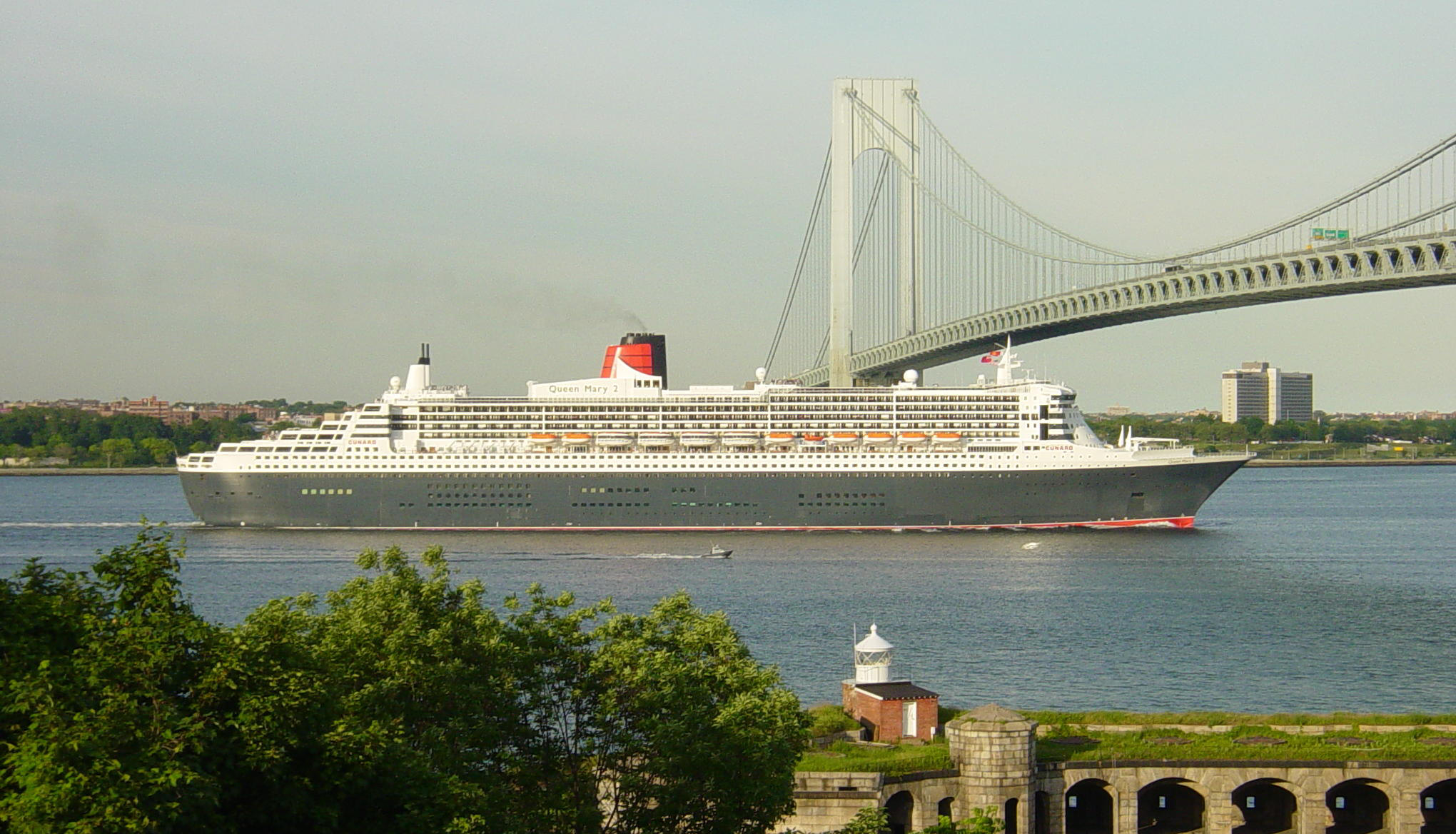
use a more direct example, look at the following photo of the Queen Mary 2.
Even allowing for the glare of the sun, by looking at the actual colors superimposed on
the ship you can see how distance causes the apparent color to fade.
To
use a more direct example, look at the following photo of the Queen Mary 2.
Even allowing for the glare of the sun, by looking at the actual colors superimposed on
the ship you can see how distance causes the apparent color to fade.
 Now
con
Now
con![]() sider the scale distance that a ship model is being viewed from. With a 1:350
scale Titanic model, viewing it from 4 feet away is the same as looking at the
real ship from about a thousand feet away. To make your model look like a
miniature of the real thing, you need to make sure the paint color will look
like it would have from that far away.
sider the scale distance that a ship model is being viewed from. With a 1:350
scale Titanic model, viewing it from 4 feet away is the same as looking at the
real ship from about a thousand feet away. To make your model look like a
miniature of the real thing, you need to make sure the paint color will look
like it would have from that far away.
This means that a model painted with the correct color scheme can still look artificial, if this scale effect isn’t taken into consideration. The best guideline is this: colors should appear more muted and less intense. With dark colors, a few drops of white can be mixed in. This softens black, for example. With light colors, a few drops of light grey can be mixed in. This reduces the brilliance of white, for example. Experimentation is needed, though, since not all mixes are compatible. Attempting to lighten the color red by adding white, for example, results in a pink color, and some overlight bright objects like the red hydrants need to be dulled down by making them darker, not lighter. In some cases you may need to use a darker and more drab shade of the original as the tinting color. See the examples below.
Most model paints are compatible with one another, providing you're not mixing acrylic (water-based) with solvent-based. Otherwise, most brands are compatible. All the Testors brands for example can be readily mixed together.
Floquil Reefer White, tinted with Floquil primer grey, yields the correct shade for scale effect on the hull:
|
|
ModelMaster Chrome Yellow, tinted with Floquil Earth (a muddy yellow/brown color), yields the correct shade for scale effect on the hull stripe:
|
|
Note that the color references shown on the Paint Reference page are for the actual color as it would have appeared on the ship, up close. Most need to be adjusted slightly for scale effect. In some cases the stock color or mix takes scale effect into consideration, and in other cases you may want to modify the colors slightly. The paint chart indicates whether or not each color or mix is correct for scale effect.
Also remember that the sun and weather fade paint and salt water and salt water spray is brutal on paint too – another reason to tone those colors down.

A good example of scale effect achieved throughout the model. Note how all
colors appear muted, even
under the glare of the photographer's lights.
(Courtesy of David Cotgreave)
![]()
WHERE TITANIC RESEARCH MEETS TITANIC CRAFTSMANSHIP SINCE 1998